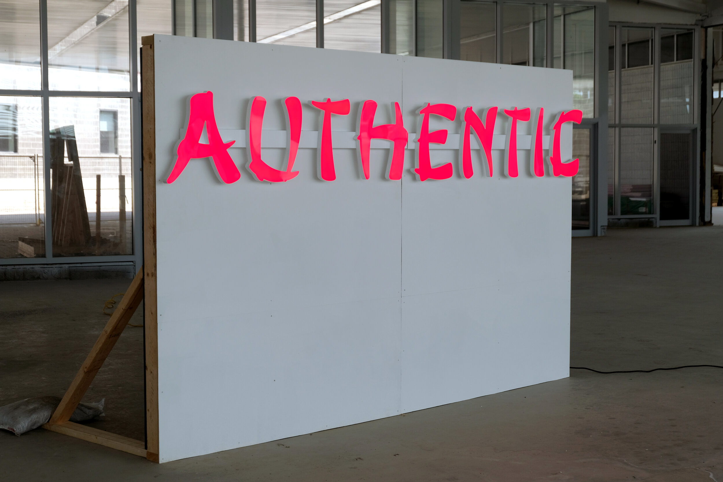
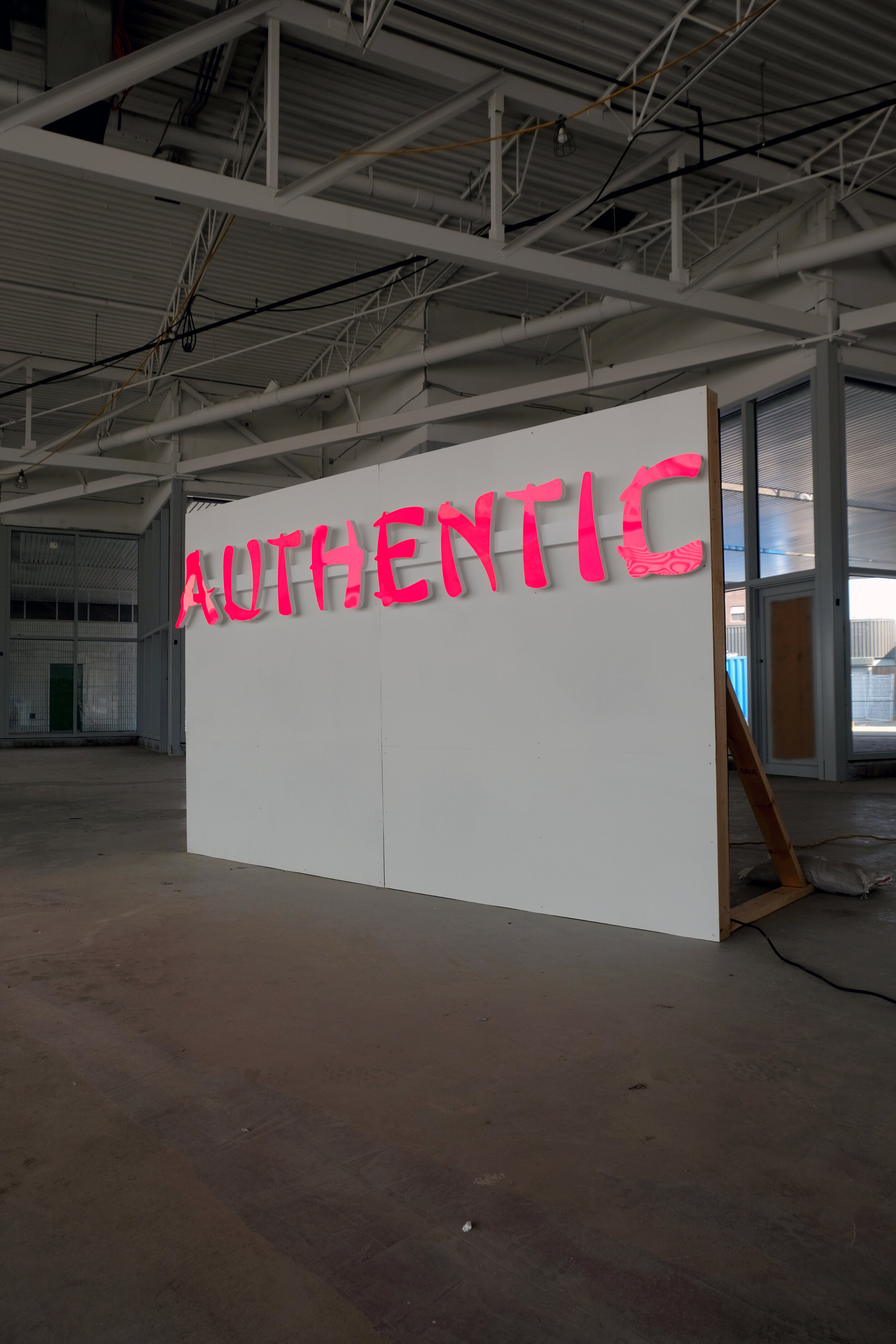

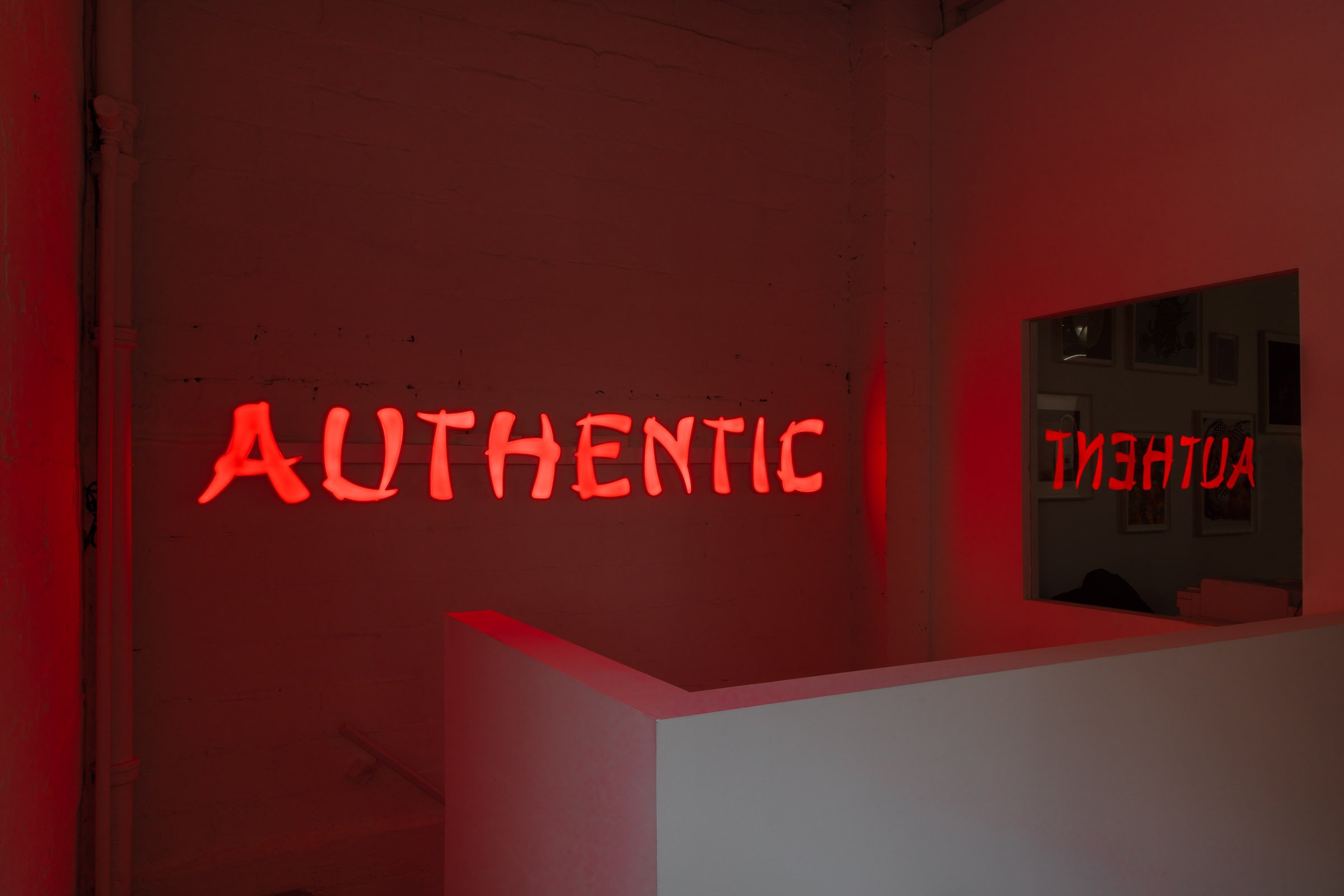
Authentic, 2020-2021
Electric sign, stainless steel, acrylic
10’ x 16”
Created by the Cleveland Type Foundry in 1883, the Mandarin font is a precursor of the font type which has come to be known as "chop suey"—a variety of fonts making faux reference to East Asian culture. Since their invention during the late 19th century, a time when Orientalism rose to dominance in western art and design, these fonts circulated heavily into the 20th century as they were paired with Yellow Peril caricatures. Chop suey fonts appeared in materials ranging from war propaganda, advertisements, and political campaigns calling for the creation of Exclusion Acts in The United States and Canada. Over the late 20th to 21st century, these fonts gradually faded from popular use due to their racial insensitivity. However, with the rise of COVID-19 related anti-Asian racism, they have been more belligerently used.
Conversely, immigrant entrepreneurs have commonly employed the use of chop suey fonts to brand their businesses and storefronts. Many signs and symbols found in Chinatowns across the world employ “ethnic fonts” such as Chop Suey, Wonton, and Mandarin. These fonts were embraced by East Asian businesses as they served the purpose of informing readers of an establishment’s cultural and often racial identity. Design historian Paul Shaw notes that ethnic type varieties have survived because stereotypes have and continue to function for commercial purposes. The signs and storefronts of businesses and services have the objective of immediately informing passers-by of the type of food they serve. Similar to chop suey cuisine popularized by Chinese American chefs, chop suey fonts did not bear any relation to East Asian culture, cuisine or calligraphy. Leveraging orientalist visions/misconceptions, it became a tool used by the diaspora. In these instances, chop suey fonts can be read as employing an inherited orientalist legacy as a means of evoking essentialist conceptions of identity and authenticity. These essentialist depictions may then become magnets for those seeking cultural understanding in the limited and diluted realms available.
In her reflection on emotion, language and bodies, Sara Ahmed observes how stickiness becomes a quality of repeated signs—how “what sticks” shows us where the sign has traveled, what it has gathered, and what has become of it. Authentic presents the history of East Asian orientalist fonts as symbols that simultaneously invoke a history of lived and learned racial prejudice and markers that many look for in search of community. The font does not present a true representation of Chinese script at all, but what it is "authentic" to, is the Asian diasporic experience. The piece is a meditation on these quintessential Asian diasporic contradictions and attempts to locate autonomy within them. Shifting the focus of chop suey font away from its formal attributes, Authentic places emphasis on authorship, circulation, autonomy and power as elements to consider for the typeface’s circulation.
Installation photos by Derek Sandbeck. Believe it or Not, AKA Artist-Run, 2021 and lfdocumentation, Re/flex, Patel Brown Gallery, 2022
This project was made possible with the support of the Toronto Arts Council and the Canada Council for the Arts.

